

CSS Grid is the most easiest and modern way to build a layout. It can create complex responsive web design Grid layout super easily.
You can build a layout in less than a minute. Can't believe it right? Well, let's get started. Before getting into CSS Grid let us know about the layout.
What is Layout?
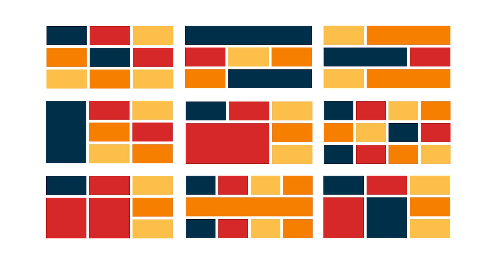
The layout is the way of structuring text, image, and the context in a certain way on a webpage. A layout contains multiple components inside it. And inside that component also contains multiple small layouts. There are two types of layout:
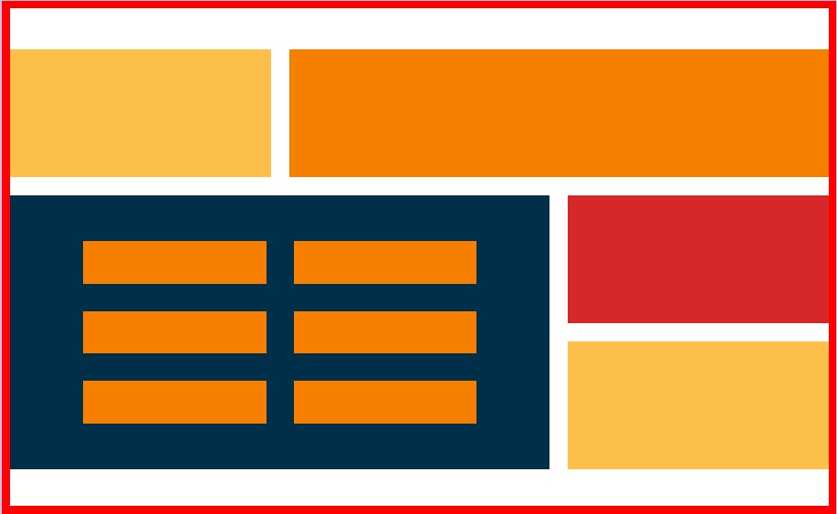
- Page layout - As the name suggests, page layout is an arrangement of the visual elements on the page containing multiple components inside it. As shown in the image below. The red border shows the page layout.
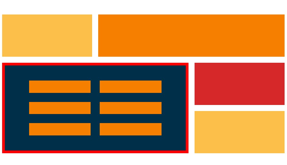
- Component layout - The component layout is the layout of components present inside a page. As shown in the image below. The red border shows the component layout.
These layouts can be built using various techniques among them most popular are:
- Float layout
- Flexbox
- CSS Grid
In this blog, we are going to discuss CSS Grid.
CSS Grid
CSS Grid is a set of CSS properties for building a 2-dimensional layout. A real-life example of a grid can be a calculator. CSS Grid has many features which makes it easy to position elements in row and column without much effort.
A grid mainly contains rows, columns and gaps. Gap between these rows and columns is also called as Gutter.
 To create grid we simply use display property and set the value to grid.
.container{
      display: grid;
}
Now we have multiple grid properties. Grid properties can be applied to Grid container and Grid items separately. Let's divide the properties according to grid container and grid items.
Grid Container Properties
Properties that can be applied to grid container are:
- grid-template-rows, grid-template-columns
- gap, row-gap, column-gap
- justify-items, align-items
- justify-content, align-content
Let us take an example to make it more clear. Suppose we have a div element, let's give it a class and name it container (you can give any name to this class as per your convenience). This div has 4 child elements inside it and let's give it a class with the name child.
<div class="container">
        <div class="child">Box1</div>
        <div class="child">Box2</div>
        <div class="child">Box3</div>
        <div class="child">Box4</div>
</div>
Now give it some CSS styling along with a display property grid. For now, we are giving child elements a border of 10px to see the result clearly but later on when we'll apply gap properties, we'll remove it.
.container{
  background-color: #f77f00;
  display: grid;
}
.child{
  background-color: #003049;
  color:#fff;
  padding:10px;
  border: 10px solid  #f77f00;
}
Output
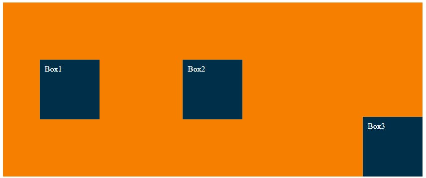
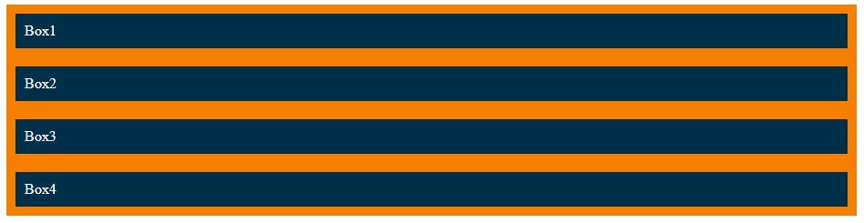 As you can see there are no changes even after applying the grid property. Elements are in their normal flow. To see changes lets apply column and row property i.e. grid-template-columns and grid-template-rows. To establish the grid row and column tracks.
Grid-template-columns
Firstly let's establish column tracks.
.container{
  background-color: #f77f00;
  display: grid;
  grid-template-columns: 300px 300px;
}
You can also write the same property in this format to avoid repetition.
grid-template-columns: repeat(2, 300px);
Output
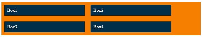 Now you can see the changes in the column. We have given 2 columns of 300px fixed length. You can increase or decrease no. of columns and also the length of tracks. Here we have given fixed units in px you can also give them in flexible units such as rem, em, %, fr, etc. The fr is a short form of a fraction of available space in a grid container. This new fr unit fills the unused space. Let's now use fr unit.
.container{
  background-color: #f77f00;
  display: grid;
  grid-template-columns: 1fr 1fr 1fr;
}
.child{
  background-color: #003049;
  color:#fff;
  padding:10px;
  margin: 10px;
}
Output
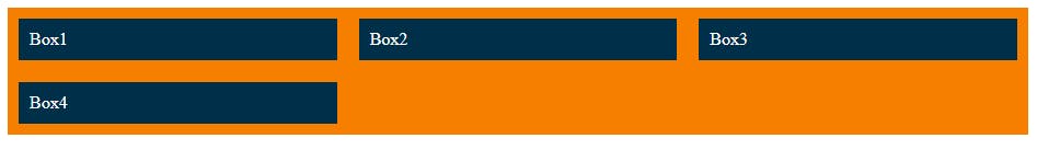 Now tracks are equally spaced according to containers length. You can also combine these fixed and flexible units. Give it a try and check the output.
.container {
  display: grid;
  grid-template-columns: 100px repeat(2, 1fr) 2fr;
}
Grid-template-rows
We can change the height of our child elements using grid-template-rows.
.container{
  background-color: #f77f00;
  display: grid;
  grid-template-columns: repeat(2, 300px);
  grid-template-rows: 1fr 2fr;
}
Output
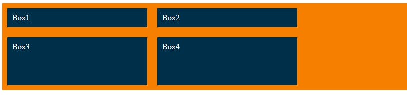 Note: If we had more than 4 child elements then it would have entered the third row which we haven't specified so by default it will take the height of its content only and these rows are what we called implicit grid since we haven't specified rows and it created on its own. When we specify row and column tracks it's called explicit grid. To control these implicit rows or columns you can use grid-auto-rows or grid-auto-columns.
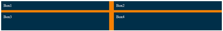
Gap, Row-gap, Column-gap
To create empty spaces between the tracks we use this property. Gap property gives the same spacing in both column and row tracks. To give different spacing in rows and columns we use row-gap and column-gap properties.
Let us now remove the border and see the drastic changes the gap property creates.
.container{
  background-color: #f77f00;
  display: grid;
  grid-template-columns: repeat(2, 1fr);
  grid-template-rows: 1fr 2fr;
}
.child{
  background-color: #003049;
  color:#fff;
  padding:10px;
}
Output
 Applying gap property to the container.
.container{
  background-color: #f77f00;
  display: grid;
  grid-template-columns: repeat(2, 1fr);
  grid-template-rows: 1fr 2fr;
  gap: 20px;

}
Output
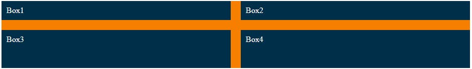 Now lets give different values to row gap and column gap using row-gap and column-gap properties.
.container{
  background-color: #f77f00;
  display: grid;
  grid-template-columns: repeat(2, 1fr);
  grid-template-rows: 1fr 2fr;
  row-gap: 10px;
  column-gap:20px;
}
Output
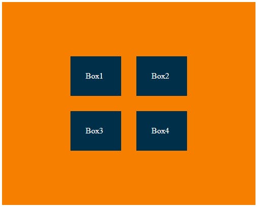
Justify-items, Align-items
To align tracks inside cells we use these properties. Justify-items for aligning grid items along the row (horizontally) and Align-items for aligning grid items along the column (vertically).
Note: For any aligning or positioning property to work there must be extra space between cells or containers.
.container{
  background-color: #f77f00;
  display: grid;
  grid-template-columns: repeat(3, 1fr);
  grid-template-rows: 350px;
  row-gap: 10px;
  column-gap:20px;
  justify-items:center;
  align-items:center;
}

.child{
  background-color: #003049;
  width:100px;
  height:100px;
  color:#fff;
  padding:10px;
}
Output
 Some other common values for align-items and justify-items that you can try are stretch, center, start, end, etc. By default align-items and justify-items are set to stretch.
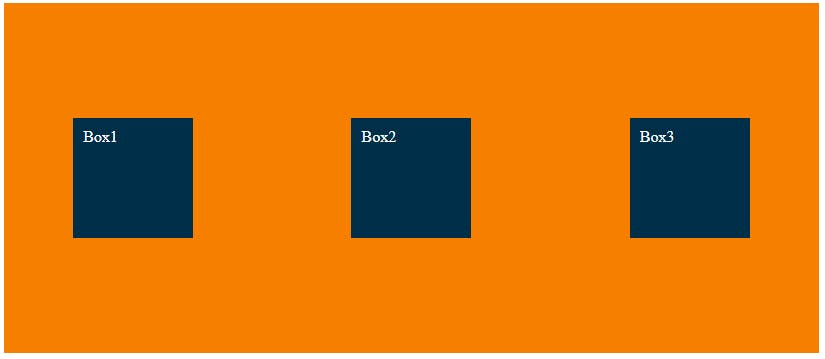
Justify-content, Align-content
Justify-content and Align-content are used to align entire tracks inside grid container and distribute empty spaces. This property only applies when the container is greater than a grid.
.container{
  height: 400px;
  width:500px;
  background-color: #f77f00;
  display: grid;
  grid-template-columns: 100px 100px;
  gap:30px;
  justify-content:center;
  align-content: center;
}
Output
 Some other common values for align-content and justify-content that you can try are center, start, end, space-between, space-around, etc. By default, align-content and justify-content are set to start.
Grid Items Properties
Properties that can be applied to grid items are:
- grid-column, grid-row
- justify-self, align-self
Grid-column, Grid-row
Grid-column and grid-row are used to place a grid item into a specific cell, based on line numbers of grid lines. To place grid items span keyword can also be used to span an item across more than one cell and it doesn't require knowing the grid line number. We can also use grid-column-start or grid-column-end property instead of grid-column and grid-row-start or grid-row-end property instead of grid-row for getting the same output but the only difference is that we will give values separately so here we will be using grid-column and grid-row directly.
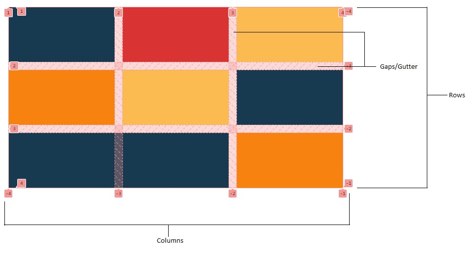
Grid-lines
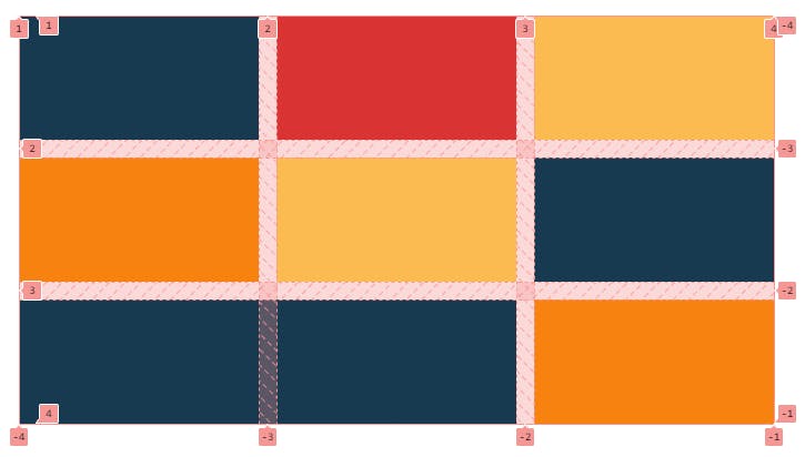 Gridlines are created automatically when we build a grid. Lines between rows and columns are grid lines that are used to position grid items.
As you can see in the image above we have a 3 by 3 grid and the line number start from 1 to 4 at the top from left to right for columns and right side top to bottom are numbered from -4 to -1 for rows, bottom left to right for the column are numbered from -4 to -1 and left side top to bottom for rows are numbered as 1 to 4.
Now let's use this grid number to position our grid items. Let us create a new example for ease of understanding.
<div class = "container">
  <div class= "box1"></div>
   <div class= "box2"></div>
  <div class= "box3"></div>
  <div class= "box4"></div>
</div>
.container{
  padding:30px;
  height:500px;
  display: grid;
  grid-template-columns: 1fr 1fr;
  grid-template-rows:  140px 140px;
  gap:20px;
}

.box1{
background-color: #003049;
}
.box2{
background-color: #d62828;
}
.box3{
background-color: #fcbf49;
}
.box4{
background-color: #f77f00;
}
Output
 Now let's position box 4(orange) at the position of box 1 (blue) using grid lines.
.box4{
background-color: #f77f00;
grid-column: 1 / 2;
grid-row: 1 / 2;
}
Output
 As you can see when box 4(orange) is positioned at the position of box 1 and all the other boxes shifted from their position. We can span box 4(orange) to the grid cell of the second column.
We have 3 ways of positioning them. First is simply by using grid line number grid-column: 1 / 3;. The second option is using grid-column: 1 / -1; here -1 simply means to extend till the last grid line no matter how many columns are there which makes it super easy to achieve it. And last is using span grid-column: 1 / span2;. It is used to avoid specifying end lines when items should span more than one column. The same can be used for grid-rows to span more than one row.
.container{
  padding:30px;
  height:500px;
  display: grid;
  grid-template-columns: 1fr 1fr;
  grid-template-rows:  140px 140px;
  gap:20px;
}

.box1{
background-color: #003049;
}
.box2{
background-color: #d62828;
}
.box3{
background-color: #fcbf49;
}
.box4{
background-color: #f77f00;
grid-column: 1 / -1;
grid-row: 1 / 2;
}
Output
 Remember we discussed briefly explicit and implicit grids, here you can see them. Box 3(yellow box) has become an implicit grid since we haven't specified a row track.
Justify-self, Align-self
We use justify-self and align-self to align items inside cells same as justify-item and align-items. The difference is justify-items and align-items are applied to all items as a whole but justify-self and align-self can align each item individually and can overwrite justify-items and align-items properties.
<div class="container">
        <div class="child">Box1</div>
        <div class="child">Box2</div>
        <div class="child child3">Box3</div>
</div>
.container{
  background-color: #f77f00;
  display: grid;
  grid-template-columns: repeat(3, 1fr);
  grid-template-rows: 350px;
  row-gap: 10px;
  column-gap:20px;
  justify-items:center;
  align-items:center;
}

.child{
  background-color: #003049;
  width:100px;
  height:100px;
  color:#fff;
  padding:10px;
}

.child3{
  justify-self:end;
  align-self:end;
}
Output
 And that was our last topic.
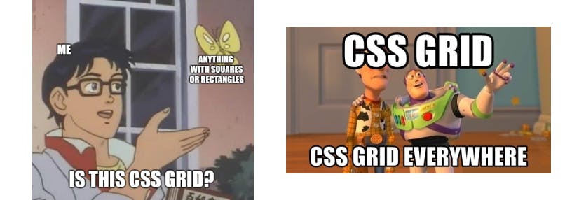
 Thanks for sticking to the end. And congratulations, now you have learned enough to get started with CSS Grids. Also here are some CSS Grid memes for you.
 Have an awesome day!
Bbye 👋.
Have an awesome day!
Bbye 👋.